Topics

See How Chata.ai Helps Teams Act Faster
See How Chata.ai Helps Teams Act Faster
Natural Language Dashboards: 7 Criteria for Choosing the Right Platform

Published
11 min read
Topics:
Self-Service Analytics

Table of Contents
Most business intelligence tools are shelfware. Purchased with good intentions, demonstrated in a flashy kickoff meeting, and quietly ignored by the people they were supposed to help. Research from Gartner's 2023 Data & Analytics Summit puts a number on it: only 32% of business users actually use the analytics tools available to them. That means nearly 7 in 10 employees have access to data they never touch. If that sounds familiar, the problem isn't your team — it's the tool.
Natural language dashboard software changes the equation. Instead of requiring users to know SQL, understand data models, or submit a request to an analyst, natural language dashboards let anyone type a plain-English question — "What were our top 10 accounts by revenue last quarter VS the previous quarter?" — and get a chart or table back in seconds. No training. No ticket. No waiting.
However, not all natural language dashboard platforms are created equal. Some feel impressive in a demo and fall apart in production. Others handle generic questions well but struggle with the specific terminology your business actually uses. And many still require technical setup that delays time-to-value by months.
This guide covers the seven criteria that actually matter when evaluating a natural language dashboard platform — the ones that determine whether your team uses it every single day or stops logging in after month or two.
What Is a Natural Language Dashboard?
A natural language dashboard is a business intelligence interface where users interact with data by typing questions in plain English rather than building queries or clicking through filter menus. The platform interprets the intent behind the question, generates the appropriate database query automatically, and returns a chart, table, or summary — typically in seconds.
Think of it as the difference between asking a colleague "how did we do in the Northeast last month?" and spending twenty minutes building a filtered bar chart yourself. The answer is the same. The effort is not.
Natural language dashboards sit at the intersection of NLP (natural language processing), data querying, and data visualization. The best platforms handle all three seamlessly — understanding what you're asking, finding the right data, and presenting it in a way that's immediately useful.
Why Traditional Dashboards Go Unused
The 32% adoption figure isn't an accident. Traditional BI tools are built for data teams, not for the sales manager, the regional ops lead, or the VP who just needs a quick answer before a board call. Three friction points kill adoption before it can take hold.
Why teams stop checking | What natural language changes |
|---|---|
✗ Answers require a data team or SQL knowledge | ✓ Anyone types a question in plain English |
✗ Pre-built charts don't match the actual question | ✓ Platform translates it to a query, runs it instantly |
✗ Wait times kill the habit before it forms | ✓ Chart or table returned in seconds, no ticket needed |
The adoption problem isn't a training problem. It's a friction problem. Natural language dashboard software removes the barrier between the question and the answer, so the whole team — not just analysts — actually uses it.

7 Criteria for Choosing a Natural Language Dashboard Platform
Criterion 1: Does the NLP-Dashboard Actually Understand Your Business's Language, Not Just Generic SQL?
A platform that can answer "show me monthly revenue" but stumbles on "what's our net ARR after churned accounts?" isn't ready for production use. Natural language query accuracy depends heavily on how well the platform understands your specific data model — your table names, your column names, your business-specific synonyms and terminology.
Look for platforms that support:
Schema awareness — the platform learns the structure of your data, not just generic SQL patterns
Synonym handling — if your team calls customers "accounts" in some contexts and "clients" in others, the platform should handle both
Domain-specific training — the ability to teach the platform your company's definitions (what counts as "active," how you calculate "churn," what "closed won" means in your CRM)
A useful test during evaluation: take ten questions that your team actually asks on a regular basis and run them through the platform.
Criterion 2: Is the Dashboard Self-Service?
This is the criterion most platforms claim to meet and few actually do. Self-serve analytics only works if the interface is genuinely intuitive to someone who has never seen it before.
Here's a simple benchmark: hand the platform to a sales manager and ask them to answer this question — "Top 10 total promotional costs by state for [brand] last month." No instructions. No walkthrough. Just the interface and the question.
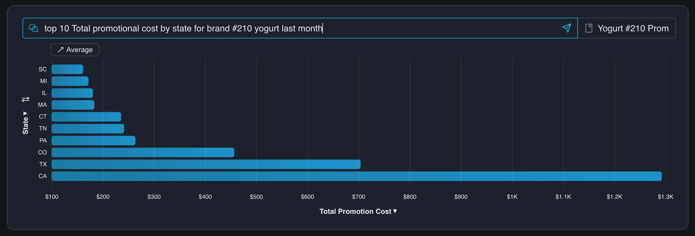
If they get an accurate chart in under two minutes, you have a real self-serve analytics tool. If they need help, or if the result is wrong, you have a demo product that will struggle in the real world.
Adoption compounds when early wins are easy. The first time someone gets a great answer without asking for help, they're hooked.
Criterion 3: Can It Answer Questions That Span Multiple Data Sources?
Real business questions don't live in one table. "Which accounts are at risk?" might need CRM data, product usage data, and billing data in the same answer. A platform that can only query one source at a time forces users to pull numbers separately and stitch them together — which is exactly the manual work natural language dashboards are supposed to eliminate.
The platforms worth evaluating can join across sources and return a single coherent answer. The user asks one question. They get one answer. They don't need to know it touched three systems to get there.
Criterion 4: Can It Be Embedded Inside Your Product?
This criterion is the one most platforms gloss over in their marketing, and it's often the one that determines whether adoption actually happens at scale.
For teams building products, embedded analytics and white-label capabilities go even further. The ability to embed natural language querying inside a SaaS product — with your own branding, your own access controls, and your own user experience — is a significant differentiator. It means your customers get the benefit of conversational data access without ever leaving your product, and without knowing which analytics platform sits underneath.
Chata.ai is purpose-built for this use case. The platform is designed to be embedded — via API or pre-built components — inside products and portals, with full white-label support so the experience feels native to the application it lives in. For technical teams building analytics into their products, this is the architectural choice that matters most.
When evaluating embedding capabilities, ask specifically: Is this a web component or iframe, or a full API that gives you control over the UI? Can you enforce your own branding and design system?
Criterion 5: Can Users Trust the Answer? Is the Dashboard Auditable?
An answer is only useful if the user trusts it. And users — especially business users who have been burned by wrong data before — will not trust an answer they can't verify.
The best natural language dashboard platforms show their work. After returning a result, they surface the underlying query (usually the generated SQL) alongside the chart or table, so a curious user can see exactly how the answer was derived. This single feature has an outsized effect on adoption.
When a sales manager can look at a result and confirm that yes, the query is filtering on closed-won deals in the right date range, they trust the answer. They share it in a meeting. They use it to make a decision.
Explainability also gives technical teams a way to catch and correct errors during rollout. If the platform generates a subtly wrong query for a specific type of question, a transparent system makes it visible and fixable. A black box buries the error until it causes a problem.
Look for platforms that show generated queries, allow users to view the data behind any visualization, and provide feedback mechanisms so the system can learn from corrections over time.
Criterion 6: Does It Enforce Row-Level Security and Access Control for Different User Roles?
For enterprise deployments — and increasingly for any deployment where multiple teams, geographies, or customer segments are involved — security is not a nice-to-have. It's a prerequisite.
Natural language interfaces introduce a specific security challenge: because users can ask arbitrary questions, the platform needs to enforce data boundaries at the query level, not just at the dashboard level. A regional sales manager should be able to ask "how did my territory perform last quarter?" and get accurate results — but shouldn't be able to add "compared to the full company" and see data they're not authorized to access.
Row-level security (RLS) is the technical mechanism that makes this work. It ensures that every query generated by the platform is filtered according to the permissions of the user making the request, automatically, without requiring the user to think about it and without requiring an admin to manually restrict every possible question.
For IT and security teams evaluating platforms, the questions to ask are: Does the platform support row-level security natively, or does it rely on the database to enforce it separately? How are user roles and permissions managed — through your existing identity provider, or through a separate system? Is there an audit log of queries run, by whom, and when? Can you enforce access controls on a per-tenant basis for multi-tenant deployments?
These aren't edge cases. For any organization where data governance matters — financial services, healthcare, enterprise SaaS — they're requirements.
Criterion 7: Does the NLP-Dashboard Drive Decisions and Actions?
McKinsey found that organizations spend roughly $3.6 billion per year on dashboards and performance-management tools. Yet many leaders still end up staring at metrics instead of acting on them. The reason isn't a lack of data. It's a lack of signal.
The platforms worth evaluating don't wait for users to check in. They monitor your metrics continuously and surface what matters before it becomes a problem.
Chata.ai does this through proactive notifications built directly into the dashboard layer. You define the metrics that matter — revenue thresholds, engagement drops, anomalies in key KPIs — and the platform watches them for you. When something changes, you get an alert. Not a dashboard full of charts to interpret. An answer: this changed, here's by how much, here's why it matters.
The result is the difference between a tool your team checks and a tool that tells your team what to do next. That shift — from passive reporting to active signal — is what separates analytics that gets used from analytics that gets ignored.
When evaluating this capability, ask: can the platform detect trends and anomalies automatically, without manual threshold-setting for every metric? Does it send alerts through the channels your team already uses? And does the notification include enough context to act on immediately — or does it just send you back to a dashboard to figure out the rest?
Quick Summary: How to Evaluate Natural Language Dashboard Software
When comparing platforms side by side, these questions will be the most important to ask:
Can non-technical users get answers without help? Ask the vendor to have someone who isn't on their sales or technical team try to answer a real business question.
Are responses accurate and explainable? Ask to see the generated query behind several results. Look for any discrepancies between what was asked and what the query actually does.
Does it integrate into existing workflows? Clarify whether "integration" means a separate login or genuine embedding within the tools your team uses daily.
Frequently Asked Questions
What is the benefit of natural language dashboards? Natural language dashboards allow anyone in an organization — not just analysts or technical users — to access data and insights instantly, by typing questions in plain English. The result is faster decisions, wider data adoption, and fewer bottlenecks on analytics teams.
How are natural language dashboards different from traditional BI tools? Traditional BI tools rely on pre-built dashboards and manual chart-building, which require either technical skills or a request to someone who has them. Natural language dashboards generate answers dynamically in response to specific questions, so users get exactly what they asked for rather than what was anticipated when the dashboard was built.
Who should use natural language dashboard software? Any team that needs fast, self-serve access to data without relying on analysts or SQL knowledge. That typically includes sales, marketing, operations, finance, and executive teams — essentially, anyone in an organization who makes decisions that depend on data.
Final Thoughts: Choose the One the Whole Team Will Use
The best natural language dashboard isn't the one with the most features. It's the one your team actually uses every day — and the one that tells them what to do next.
Evaluate on trust (does it show its work and return accurate answers?), speed (how fast can a new user get their first real answer?), simplicity (would a non-technical person find it intuitive on day one?), workflow fit (does it live where your team already works?), and action (does it surface the signal before you think to look for it?).
The last one matters more than most buyers realize. A dashboard your team has to check is a habit that breaks. A platform that monitors your metrics and tells you when something needs attention is a tool that works even when no one is looking. That's the difference between data that informs and data that drives.
Ready to see what a natural language dashboard looks like when it's built for adoption? Explore how Chata.ai embeds conversational analytics directly into your product or workflow — and get your team from question to answer in seconds.
Topics
See How Chata.ai Helps Teams Act Faster
Natural Language Dashboards: 7 Criteria for Choosing the Right Platform
Published
11 min read
Topics:
Self-Service Analytics
Table of Contents
Most business intelligence tools are shelfware. Purchased with good intentions, demonstrated in a flashy kickoff meeting, and quietly ignored by the people they were supposed to help. Research from Gartner's 2023 Data & Analytics Summit puts a number on it: only 32% of business users actually use the analytics tools available to them. That means nearly 7 in 10 employees have access to data they never touch. If that sounds familiar, the problem isn't your team — it's the tool.
Natural language dashboard software changes the equation. Instead of requiring users to know SQL, understand data models, or submit a request to an analyst, natural language dashboards let anyone type a plain-English question — "What were our top 10 accounts by revenue last quarter VS the previous quarter?" — and get a chart or table back in seconds. No training. No ticket. No waiting.
However, not all natural language dashboard platforms are created equal. Some feel impressive in a demo and fall apart in production. Others handle generic questions well but struggle with the specific terminology your business actually uses. And many still require technical setup that delays time-to-value by months.
This guide covers the seven criteria that actually matter when evaluating a natural language dashboard platform — the ones that determine whether your team uses it every single day or stops logging in after month or two.
What Is a Natural Language Dashboard?
A natural language dashboard is a business intelligence interface where users interact with data by typing questions in plain English rather than building queries or clicking through filter menus. The platform interprets the intent behind the question, generates the appropriate database query automatically, and returns a chart, table, or summary — typically in seconds.
Think of it as the difference between asking a colleague "how did we do in the Northeast last month?" and spending twenty minutes building a filtered bar chart yourself. The answer is the same. The effort is not.
Natural language dashboards sit at the intersection of NLP (natural language processing), data querying, and data visualization. The best platforms handle all three seamlessly — understanding what you're asking, finding the right data, and presenting it in a way that's immediately useful.
Why Traditional Dashboards Go Unused
The 32% adoption figure isn't an accident. Traditional BI tools are built for data teams, not for the sales manager, the regional ops lead, or the VP who just needs a quick answer before a board call. Three friction points kill adoption before it can take hold.
Why teams stop checking | What natural language changes |
|---|---|
✗ Answers require a data team or SQL knowledge | ✓ Anyone types a question in plain English |
✗ Pre-built charts don't match the actual question | ✓ Platform translates it to a query, runs it instantly |
✗ Wait times kill the habit before it forms | ✓ Chart or table returned in seconds, no ticket needed |
The adoption problem isn't a training problem. It's a friction problem. Natural language dashboard software removes the barrier between the question and the answer, so the whole team — not just analysts — actually uses it.
7 Criteria for Choosing a Natural Language Dashboard Platform
Criterion 1: Does the NLP-Dashboard Actually Understand Your Business's Language, Not Just Generic SQL?
A platform that can answer "show me monthly revenue" but stumbles on "what's our net ARR after churned accounts?" isn't ready for production use. Natural language query accuracy depends heavily on how well the platform understands your specific data model — your table names, your column names, your business-specific synonyms and terminology.
Look for platforms that support:
Schema awareness — the platform learns the structure of your data, not just generic SQL patterns
Synonym handling — if your team calls customers "accounts" in some contexts and "clients" in others, the platform should handle both
Domain-specific training — the ability to teach the platform your company's definitions (what counts as "active," how you calculate "churn," what "closed won" means in your CRM)
A useful test during evaluation: take ten questions that your team actually asks on a regular basis and run them through the platform.
Criterion 2: Is the Dashboard Self-Service?
This is the criterion most platforms claim to meet and few actually do. Self-serve analytics only works if the interface is genuinely intuitive to someone who has never seen it before.
Here's a simple benchmark: hand the platform to a sales manager and ask them to answer this question — "Top 10 total promotional costs by state for [brand] last month." No instructions. No walkthrough. Just the interface and the question.
If they get an accurate chart in under two minutes, you have a real self-serve analytics tool. If they need help, or if the result is wrong, you have a demo product that will struggle in the real world.
Adoption compounds when early wins are easy. The first time someone gets a great answer without asking for help, they're hooked.
Criterion 3: Can It Answer Questions That Span Multiple Data Sources?
Real business questions don't live in one table. "Which accounts are at risk?" might need CRM data, product usage data, and billing data in the same answer. A platform that can only query one source at a time forces users to pull numbers separately and stitch them together — which is exactly the manual work natural language dashboards are supposed to eliminate.
The platforms worth evaluating can join across sources and return a single coherent answer. The user asks one question. They get one answer. They don't need to know it touched three systems to get there.
Criterion 4: Can It Be Embedded Inside Your Product?
This criterion is the one most platforms gloss over in their marketing, and it's often the one that determines whether adoption actually happens at scale.
For teams building products, embedded analytics and white-label capabilities go even further. The ability to embed natural language querying inside a SaaS product — with your own branding, your own access controls, and your own user experience — is a significant differentiator. It means your customers get the benefit of conversational data access without ever leaving your product, and without knowing which analytics platform sits underneath.
Chata.ai is purpose-built for this use case. The platform is designed to be embedded — via API or pre-built components — inside products and portals, with full white-label support so the experience feels native to the application it lives in. For technical teams building analytics into their products, this is the architectural choice that matters most.
When evaluating embedding capabilities, ask specifically: Is this a web component or iframe, or a full API that gives you control over the UI? Can you enforce your own branding and design system?
Criterion 5: Can Users Trust the Answer? Is the Dashboard Auditable?
An answer is only useful if the user trusts it. And users — especially business users who have been burned by wrong data before — will not trust an answer they can't verify.
The best natural language dashboard platforms show their work. After returning a result, they surface the underlying query (usually the generated SQL) alongside the chart or table, so a curious user can see exactly how the answer was derived. This single feature has an outsized effect on adoption.
When a sales manager can look at a result and confirm that yes, the query is filtering on closed-won deals in the right date range, they trust the answer. They share it in a meeting. They use it to make a decision.
Explainability also gives technical teams a way to catch and correct errors during rollout. If the platform generates a subtly wrong query for a specific type of question, a transparent system makes it visible and fixable. A black box buries the error until it causes a problem.
Look for platforms that show generated queries, allow users to view the data behind any visualization, and provide feedback mechanisms so the system can learn from corrections over time.
Criterion 6: Does It Enforce Row-Level Security and Access Control for Different User Roles?
For enterprise deployments — and increasingly for any deployment where multiple teams, geographies, or customer segments are involved — security is not a nice-to-have. It's a prerequisite.
Natural language interfaces introduce a specific security challenge: because users can ask arbitrary questions, the platform needs to enforce data boundaries at the query level, not just at the dashboard level. A regional sales manager should be able to ask "how did my territory perform last quarter?" and get accurate results — but shouldn't be able to add "compared to the full company" and see data they're not authorized to access.
Row-level security (RLS) is the technical mechanism that makes this work. It ensures that every query generated by the platform is filtered according to the permissions of the user making the request, automatically, without requiring the user to think about it and without requiring an admin to manually restrict every possible question.
For IT and security teams evaluating platforms, the questions to ask are: Does the platform support row-level security natively, or does it rely on the database to enforce it separately? How are user roles and permissions managed — through your existing identity provider, or through a separate system? Is there an audit log of queries run, by whom, and when? Can you enforce access controls on a per-tenant basis for multi-tenant deployments?
These aren't edge cases. For any organization where data governance matters — financial services, healthcare, enterprise SaaS — they're requirements.
Criterion 7: Does the NLP-Dashboard Drive Decisions and Actions?
McKinsey found that organizations spend roughly $3.6 billion per year on dashboards and performance-management tools. Yet many leaders still end up staring at metrics instead of acting on them. The reason isn't a lack of data. It's a lack of signal.
The platforms worth evaluating don't wait for users to check in. They monitor your metrics continuously and surface what matters before it becomes a problem.
Chata.ai does this through proactive notifications built directly into the dashboard layer. You define the metrics that matter — revenue thresholds, engagement drops, anomalies in key KPIs — and the platform watches them for you. When something changes, you get an alert. Not a dashboard full of charts to interpret. An answer: this changed, here's by how much, here's why it matters.
The result is the difference between a tool your team checks and a tool that tells your team what to do next. That shift — from passive reporting to active signal — is what separates analytics that gets used from analytics that gets ignored.
When evaluating this capability, ask: can the platform detect trends and anomalies automatically, without manual threshold-setting for every metric? Does it send alerts through the channels your team already uses? And does the notification include enough context to act on immediately — or does it just send you back to a dashboard to figure out the rest?
Quick Summary: How to Evaluate Natural Language Dashboard Software
When comparing platforms side by side, these questions will be the most important to ask:
Can non-technical users get answers without help? Ask the vendor to have someone who isn't on their sales or technical team try to answer a real business question.
Are responses accurate and explainable? Ask to see the generated query behind several results. Look for any discrepancies between what was asked and what the query actually does.
Does it integrate into existing workflows? Clarify whether "integration" means a separate login or genuine embedding within the tools your team uses daily.
Frequently Asked Questions
What is the benefit of natural language dashboards? Natural language dashboards allow anyone in an organization — not just analysts or technical users — to access data and insights instantly, by typing questions in plain English. The result is faster decisions, wider data adoption, and fewer bottlenecks on analytics teams.
How are natural language dashboards different from traditional BI tools? Traditional BI tools rely on pre-built dashboards and manual chart-building, which require either technical skills or a request to someone who has them. Natural language dashboards generate answers dynamically in response to specific questions, so users get exactly what they asked for rather than what was anticipated when the dashboard was built.
Who should use natural language dashboard software? Any team that needs fast, self-serve access to data without relying on analysts or SQL knowledge. That typically includes sales, marketing, operations, finance, and executive teams — essentially, anyone in an organization who makes decisions that depend on data.
Final Thoughts: Choose the One the Whole Team Will Use
The best natural language dashboard isn't the one with the most features. It's the one your team actually uses every day — and the one that tells them what to do next.
Evaluate on trust (does it show its work and return accurate answers?), speed (how fast can a new user get their first real answer?), simplicity (would a non-technical person find it intuitive on day one?), workflow fit (does it live where your team already works?), and action (does it surface the signal before you think to look for it?).
The last one matters more than most buyers realize. A dashboard your team has to check is a habit that breaks. A platform that monitors your metrics and tells you when something needs attention is a tool that works even when no one is looking. That's the difference between data that informs and data that drives.
Ready to see what a natural language dashboard looks like when it's built for adoption? Explore how Chata.ai embeds conversational analytics directly into your product or workflow — and get your team from question to answer in seconds.
More Updates


