Topics

See How Chata.ai Helps Teams Act Faster
See How Chata.ai Helps Teams Act Faster
Histogram vs Bar Graph: Key Differences and When to Use Each

Published
6 min read
Topics:
Self-Service Analytics

Table of Contents
Understanding your data often starts with choosing the right visualization. Two of the most common charts used in analytics are a histogram and bar graph. While they may look similar, they help answer very different questions.
Knowing when to use each chart makes it easier to uncover patterns, identify trends, and better understand what your data is telling you.
In this post, we’ll explain the difference between a histogram vs bar graph, when to use each one, and how they help teams explore data more effectively.
What is a Histogram?
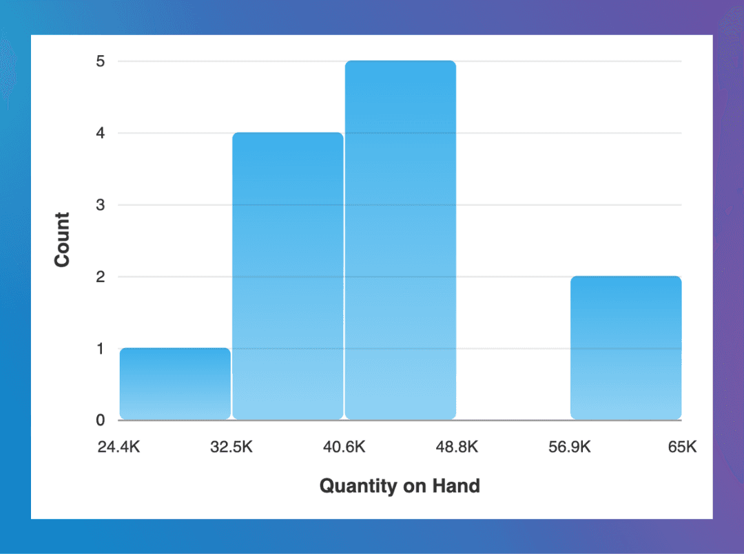
A histogram shows how a single set of continuous numerical data is distributed. Instead of comparing separate categories, it groups all your data points into ranges—called bins or buckets—and shows how many values fall into each range.
Because the data is continuous (one range flows directly into the next), the bars in a histogram touch. There are no gaps. And unlike a bar graph, you cannot reorder the bars—the buckets must stay in numerical sequence, or the chart stops making sense.
Some histogram examples include:
Order value ranges
Customer ages
Invoice or payment amounts
Supplier delivery lead times
Histograms help answer questions like:
Where do most values fall?
Are there outliers?
Is the data evenly distributed or skewed?
For example, a histogram of transaction values might reveal that most purchases fall between $400 and $800, with only a few large purchases above $2000.
These kinds of patterns can be difficult to spot in raw data but become immediately visible through a histogram.
The video below shows how to create a histogram in Chata.ai, allowing you to quickly visualize the distribution of numeric data.
In this example, values are grouped into ranges so you can easily see patterns, clusters, and outliers in the data. These insights can be especially useful in customizable dashboards when tracking important KPIs over time.
What is a Bar Graph?
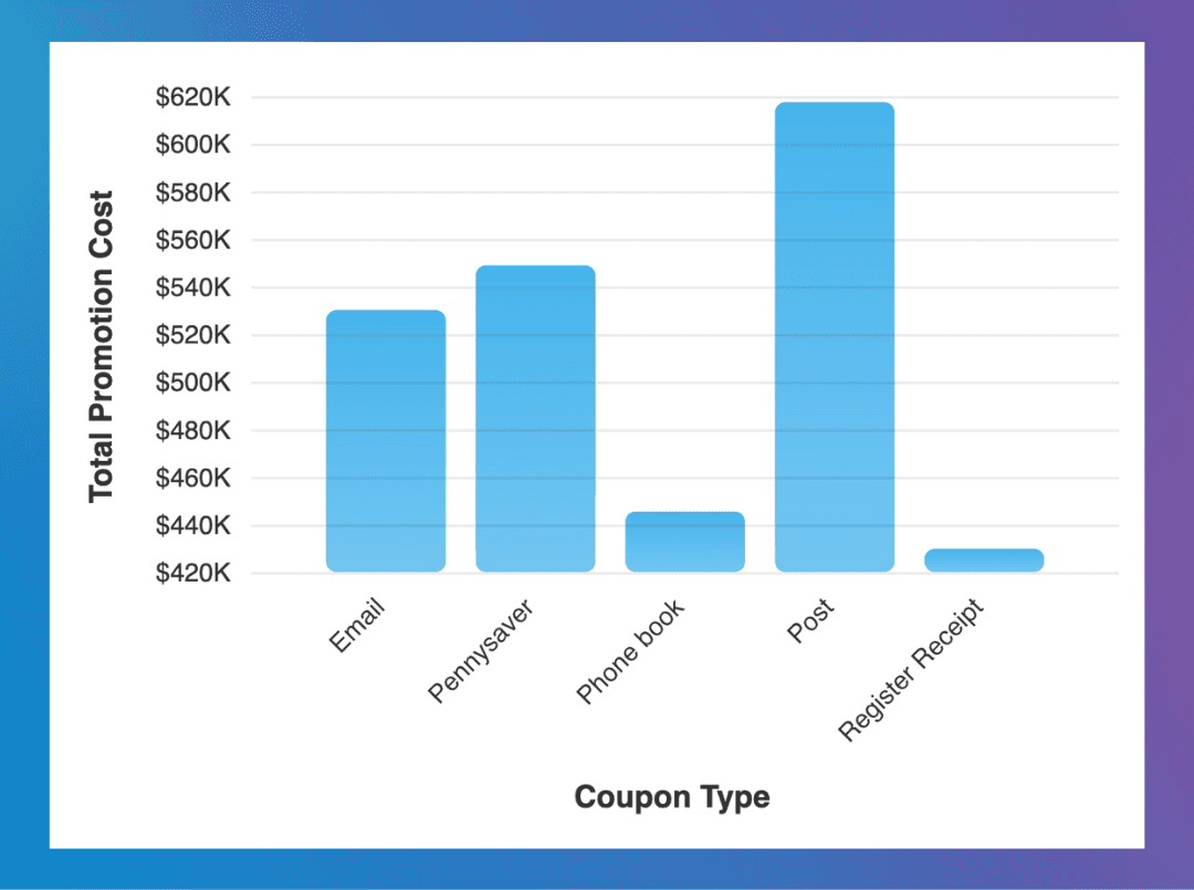
A bar graph, commonly knows as bar charts, compares separate categories of data. Each bar represents one category—a product, a region, a time period—and its height shows the value for that category.
The key word is separate. Because the categories are distinct from one another, bar graphs have small gaps between the bars. You could rearrange them in any order (alphabetical, highest to lowest, chronological) and the chart would still make sense.
Examples include:
Revenue by product category
Leads by marketing campaign
Customers by region
Inventory by warehouse location
Bar graphs are ideal for answering questions like:
Which category performs best?
How do groups compare?
Where are the largest differences?
For instance, a bar graph comparing revenue across product lines can quickly highlight which products generate the most sales.
Spotting the Difference Quickly
One visual clue can help you quickly tell whether you’re looking at a histogram or a bar graph.
Histogram
Bars typically touch each other
Each bar represents a range of numeric values
Bar Graph
Bars usually have space between them
Each bar represents a distinct category
This small visual difference helps readers quickly understand the type of data being displayed.
Histogram vs Bar Graph: Side-by-Side Comparison
At first glance, a histogram or bar graph can look very similar. Both use bars to visualize data, but they serve different purposes.
Here’s a quick comparison:
Histogram | Bar Graph or Bar Chart | |
|---|---|---|
What is shows | Shows distribution of numeric data | Compares categories |
Bars | Bars touch each other | Bars have gaps between them |
Can you reorder bars? | No — order is fixed | Yes — any order works |
X-axis | Uses ranges (buckets) | Uses labels or groups |
Example | Transaction size | Revenue by product |
The key difference comes down to the type of data you’re analyzing.
If your data is numeric and continuous, a histogram helps reveal patterns in how values are distributed.
If your data consists of distinct categories, a bar graph makes it easier to compare groups.
Understanding this distinction helps ensure your visualizations accurately reflect what the data is telling you.
Avoiding a Common Bar Chart Visualization Mistake
A frequent mistake is using a bar graph to display numeric ranges.
For example, someone might create categories like:
$0–$50
$50–$100
$100–$200
Although this may appear as a bar chart, the underlying data is actually continuous numeric data. In these cases, a histogram usually provides a more accurate representation of the data’s distribution.
Using the correct chart helps ensure that patterns, trends, and outliers remain visible.
A Quick Rule of Thumb
When you're deciding which chart to use, ask yourself one question: Is the data continuous or categorical?
• Continuous data (ages, amounts, durations, temperatures) → Histogram
• Categorical data (products, regions, campaigns, teams) → Bar graph
That single question will get you to the right answer almost every time.
How Chata.ai Handles This Automatically
Choosing the right chart type is one of those things that sounds simple but causes real friction in practice, especially for business users who aren't data analysts.
With Chata.ai, users don't have to make that call manually. When asking a question using natural language queries —"show me the distribution of invoice amounts" or "compare revenue by product line" — the platform automatically selects the correct visualization. Continuous data gets a histogram. Categorical comparisons get a bar chart.
The same logic applies when building customizable dashboards. Instead of configuring chart types by hand, users describe what they want to see, and the right visualization is generated automatically.

Frequently Asked Questions
What is the main difference between a histogram and a bar graph?
A bar graph compares distinct categories—like sales by region or leads by channel. A histogram shows the distribution of a single continuous dataset—like how invoice amounts are spread across different value ranges. They look similar but answer fundamentally different questions.
Why do the bars in a histogram touch each other?
Because the data is continuous. The end of one bucket is the exact start of the next, so there's no logical gap between them. Gaps between bars signal that the categories are separate and distinct—which is the opposite of what a histogram is showing.
Can you reorder the bars in a histogram?
No. The buckets in a histogram follow a fixed numerical sequence. Rearranging them would break the representation of the distribution entirely. Bar graph bars, on the other hand, can be sorted in any order that makes sense for your audience.
Which chart is better for spotting outliers?
A histogram. Because it shows the full spread of a dataset across a continuous range, values that fall far outside the normal cluster appear as isolated bars—making anomalies much easier to spot than they would be in a table or a bar graph.
Topics
See How Chata.ai Helps Teams Act Faster
Histogram vs Bar Graph: Key Differences and When to Use Each
Published
6 min read
Topics:
Self-Service Analytics
Table of Contents
Understanding your data often starts with choosing the right visualization. Two of the most common charts used in analytics are a histogram and bar graph. While they may look similar, they help answer very different questions.
Knowing when to use each chart makes it easier to uncover patterns, identify trends, and better understand what your data is telling you.
In this post, we’ll explain the difference between a histogram vs bar graph, when to use each one, and how they help teams explore data more effectively.
What is a Histogram?
A histogram shows how a single set of continuous numerical data is distributed. Instead of comparing separate categories, it groups all your data points into ranges—called bins or buckets—and shows how many values fall into each range.
Because the data is continuous (one range flows directly into the next), the bars in a histogram touch. There are no gaps. And unlike a bar graph, you cannot reorder the bars—the buckets must stay in numerical sequence, or the chart stops making sense.
Some histogram examples include:
Order value ranges
Customer ages
Invoice or payment amounts
Supplier delivery lead times
Histograms help answer questions like:
Where do most values fall?
Are there outliers?
Is the data evenly distributed or skewed?
For example, a histogram of transaction values might reveal that most purchases fall between $400 and $800, with only a few large purchases above $2000.
These kinds of patterns can be difficult to spot in raw data but become immediately visible through a histogram.
The video below shows how to create a histogram in Chata.ai, allowing you to quickly visualize the distribution of numeric data.
In this example, values are grouped into ranges so you can easily see patterns, clusters, and outliers in the data. These insights can be especially useful in customizable dashboards when tracking important KPIs over time.
What is a Bar Graph?
A bar graph, commonly knows as bar charts, compares separate categories of data. Each bar represents one category—a product, a region, a time period—and its height shows the value for that category.
The key word is separate. Because the categories are distinct from one another, bar graphs have small gaps between the bars. You could rearrange them in any order (alphabetical, highest to lowest, chronological) and the chart would still make sense.
Examples include:
Revenue by product category
Leads by marketing campaign
Customers by region
Inventory by warehouse location
Bar graphs are ideal for answering questions like:
Which category performs best?
How do groups compare?
Where are the largest differences?
For instance, a bar graph comparing revenue across product lines can quickly highlight which products generate the most sales.
Spotting the Difference Quickly
One visual clue can help you quickly tell whether you’re looking at a histogram or a bar graph.
Histogram
Bars typically touch each other
Each bar represents a range of numeric values
Bar Graph
Bars usually have space between them
Each bar represents a distinct category
This small visual difference helps readers quickly understand the type of data being displayed.
Histogram vs Bar Graph: Side-by-Side Comparison
At first glance, a histogram or bar graph can look very similar. Both use bars to visualize data, but they serve different purposes.
Here’s a quick comparison:
Histogram | Bar Graph or Bar Chart | |
|---|---|---|
What is shows | Shows distribution of numeric data | Compares categories |
Bars | Bars touch each other | Bars have gaps between them |
Can you reorder bars? | No — order is fixed | Yes — any order works |
X-axis | Uses ranges (buckets) | Uses labels or groups |
Example | Transaction size | Revenue by product |
The key difference comes down to the type of data you’re analyzing.
If your data is numeric and continuous, a histogram helps reveal patterns in how values are distributed.
If your data consists of distinct categories, a bar graph makes it easier to compare groups.
Understanding this distinction helps ensure your visualizations accurately reflect what the data is telling you.
Avoiding a Common Bar Chart Visualization Mistake
A frequent mistake is using a bar graph to display numeric ranges.
For example, someone might create categories like:
$0–$50
$50–$100
$100–$200
Although this may appear as a bar chart, the underlying data is actually continuous numeric data. In these cases, a histogram usually provides a more accurate representation of the data’s distribution.
Using the correct chart helps ensure that patterns, trends, and outliers remain visible.
A Quick Rule of Thumb
When you're deciding which chart to use, ask yourself one question: Is the data continuous or categorical?
• Continuous data (ages, amounts, durations, temperatures) → Histogram
• Categorical data (products, regions, campaigns, teams) → Bar graph
That single question will get you to the right answer almost every time.
How Chata.ai Handles This Automatically
Choosing the right chart type is one of those things that sounds simple but causes real friction in practice, especially for business users who aren't data analysts.
With Chata.ai, users don't have to make that call manually. When asking a question using natural language queries —"show me the distribution of invoice amounts" or "compare revenue by product line" — the platform automatically selects the correct visualization. Continuous data gets a histogram. Categorical comparisons get a bar chart.
The same logic applies when building customizable dashboards. Instead of configuring chart types by hand, users describe what they want to see, and the right visualization is generated automatically.
Frequently Asked Questions
What is the main difference between a histogram and a bar graph?
A bar graph compares distinct categories—like sales by region or leads by channel. A histogram shows the distribution of a single continuous dataset—like how invoice amounts are spread across different value ranges. They look similar but answer fundamentally different questions.
Why do the bars in a histogram touch each other?
Because the data is continuous. The end of one bucket is the exact start of the next, so there's no logical gap between them. Gaps between bars signal that the categories are separate and distinct—which is the opposite of what a histogram is showing.
Can you reorder the bars in a histogram?
No. The buckets in a histogram follow a fixed numerical sequence. Rearranging them would break the representation of the distribution entirely. Bar graph bars, on the other hand, can be sorted in any order that makes sense for your audience.
Which chart is better for spotting outliers?
A histogram. Because it shows the full spread of a dataset across a continuous range, values that fall far outside the normal cluster appear as isolated bars—making anomalies much easier to spot than they would be in a table or a bar graph.
More Updates


