Topics

Help teams explore data without compromising privacy.
Help teams explore data without compromising privacy.
Comparative Data Alerts: No More Pulling Two Reports and Doing the Math

Published
5 min read
Topics:
Proactive Alerts

Table of Contents
Most business dashboards are good at answering one kind of question: is this number above or below some line? Sales under $40,000 this month → flag it. Inventory under 50 units → flag it. That works fine until the real question you're asking isn't about a fixed line at all. It's about the relationship between two values.
Questions like "are we spending more on this promotion than it's bringing in? ", "did sales drop compared to last week?", or "is this store running low compared to the one down the road?" need a different approach. Those are comparison questions and answering them usually means somebody must remember to pull two reports, put them side by side, and do the math themselves.
Comparative data alerts are built to automate that task.
What is a Comparative Data Alert?
A comparative data alert monitors a specific numerical relationship between two data points: either columns within a single query result, or the outputs of two separate underlying queries from one system. Instead of checking whether a metric crossed a static line, it checks whether one metric has moved out of proportion to another. With Chata.ai, it keeps asking on its own, on whatever schedule you set. In result, you receive a notification that shows compex KPIs or report compared.
Comparative AI alerts are configured using relational operators:
% higher than — fires when Metric A exceeds Metric B by a defined percentage margin
% lower than — catches when one metric falls behind another at a meaningful rate
Times (multiple) — triggers when one value reaches N× another
More than / Less than — absolute comparison between two live query outputs
Comparing two columns from the same query. This is putting two metrics side by side that were already sitting in the same result: inventory next to sales, customer acquisition cost next to revenue per customer. You're not running two separate reports; you're just finally looking at two numbers that were always related but never actually compared.
Comparing the results of two different queries. This one's more flexible, and it doesn't even require a different metric. It can be the exact same metric measured twice: this week versus last week, one region versus another, one product line versus another. "Sales this week are 25% lower than last week" is sales versus sales. The only thing that changed is which slice of time or which segment each query is looking at.
Either way, you set the relationship once using an operator and the alert takes it from there. "Notify me if promotional spend is running 25% higher than sales in the same period" stops being a task on someone's calendar and becomes a rule that just runs.
That's the whole shift. Nobody has to remember to run the comparison anymore. The system just watches it.

How Do I Create a Data Alert Comparing This Week Sales VS Last Week Sales?
It starts the same way most things in Chata.ai start, with a plain-language query. Say you want to keep an eye on liquor sales across southern states, broken out by product, for the week. You type: "total online liquor sales by state in the south by product this week."
When the result comes back, the option to turn it into an alert is sitting right there in the toolbar — three dots, "Create a Data Alert." No separate tool, no different interface. Your original query is already filled in.
From there the setup takes about a minute. Pick what to compare against, in this case, the same query run against last week's data. Choose the operator that defines the relationship you're watching (say, % lower than). Set how often it should check, daily or weekly, or as frequently as every hour if the data moves fast enough to warrant it. Add a short title so the alert makes sense when it fires three weeks from now.
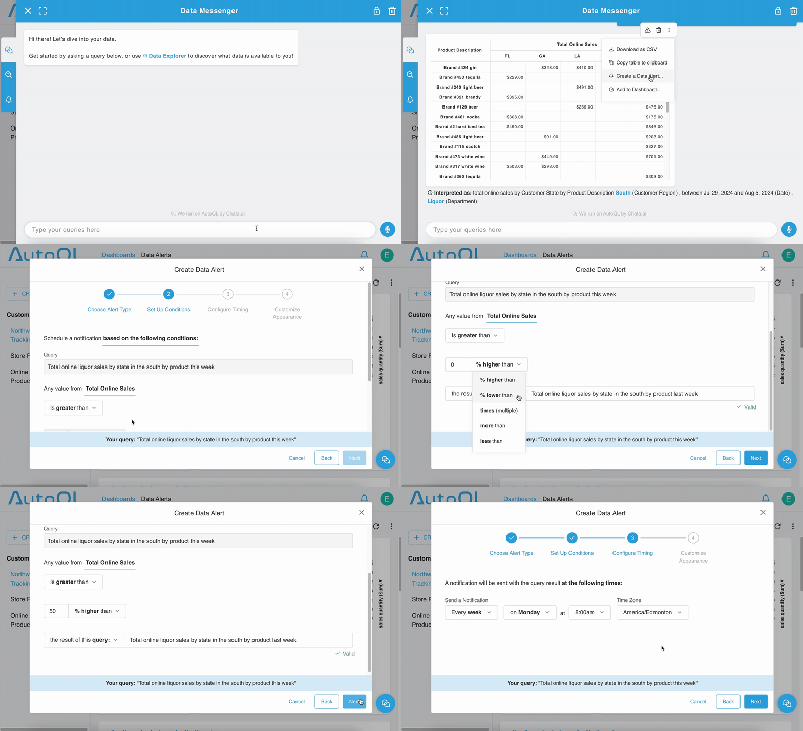
After that, it runs quietly in the background. When it triggers, a notification dot appears on the bell icon by your profile. Click through and the results are waiting.
No IT ticket required anywhere in that process. Every query and every alert, from the first plain-language question to the comparison logic to the final save, is something a business user configures start to finish, no technical knowledge required. No backlog of ad hoc comparison requests landing on the data team.
Comparative Data Alerts Across Industries
Retail & eCommerce: Catching Margin Drift in the Campaign
Promotional spend running at 1.5× the revenue it generates doesn't show up as a budget overrun or a missed revenue target. Both numbers can be within range individually. A comparative alert configured to fire when spend-to-return ratio exceeds a defined threshold catches it while the campaign is still running, not in the post-mortem.
The same logic applies to inventory. Rather than alerting on raw stock count, a comparative alert flags when stock at a high-traffic location drops below 30% of equivalent stock at comparable stores. So, the alert is measuring low stock compared to nearby stores with real demand.
Financial Services: Spotting the Ratio Before the Review
For wealth management and financial institutions, the most expensive problems are proportional drift: fee revenue growing slower than Assets Under Management (AUM), advisor activity falling while churn signals rise. A single-threshold alert on either metric misses both.
A comparative AI alert that fires when new account onboarding completions drop more than 20% below inbound applications in the same week gives teams a leading indicator before a conversion problem surfaces in quarterly reporting. The signal isn't "240 onboardings." It's "240 completions against 340 applications — gap widening for three weeks."
Check few others examples in the table below.
Industry | Metric A | Operator | Metric B | What It Catches |
Retail | Stock at Location A | less than | Average stock at comparable stores | Relative understocking before a stockout |
Retail | Return rate by product this month | % higher than | Return rate same product last month | Product quality or listing issue |
Financial Services | Fee revenue this quarter | % lower than | AUM growth this quarter | Fee compression |
Financial Services | Advisor activity by client | less than | Churn signals by client | At-risk accounts being under-serviced |
Logistics | Delivery delays on Route A | % higher than | Average delays across all routes | Route-specific divergence from baseline |
Logistics | Fuel cost per delivery — Driver X | times (2×) | Fleet average fuel cost per delivery | Driver or vehicle efficiency outlier |
Operations | Support tickets opened | more than | Support tickets resolved | Backlog growing faster than resolution |
Operations | Fulfillment cost this week | % higher than | Revenue this week | Margin compression |
Frequently Asked Questions
What's the difference between a comparative alert and a standard BI tool alert?
Most BI tools alert when a single metric crosses a static threshold. Comparative alerts monitor how two metrics relate to each other in real time. As underlying data changes, the relationship updates automatically — no manual reconfiguration needed.
Does setting up a comparative alert require SQL?
No. Alerts are configured from the natural language query interface. The underlying engine handles translation — the analyst sets the condition using operator dropdowns, not code.
Can business users configure comparative alerts, or does it require an analyst?
Any user with access to the Data Messenger interface can set one up. The configuration uses operator dropdowns, not code — so a business user who can run a query can build an alert on that query. For analytics teams looking to reduce ad hoc monitoring requests, that's the point.
Ready to Stop Doing the Comparison Yourself?
If a relationship between two values matters enough to check regularly, it's worth setting up automation once and letting it watch your numbers. For data teams managing this across dozens of business users, that also means fewer ad-hoc requests and more visibility into what's actually being monitored.
Curious where a comparative AI alert could save your team the most time?
Topics
Help teams explore data without compromising privacy.
Comparative Data Alerts: No More Pulling Two Reports and Doing the Math
Published
5 min read
Topics:
Proactive Alerts
Table of Contents
Most business dashboards are good at answering one kind of question: is this number above or below some line? Sales under $40,000 this month → flag it. Inventory under 50 units → flag it. That works fine until the real question you're asking isn't about a fixed line at all. It's about the relationship between two values.
Questions like "are we spending more on this promotion than it's bringing in? ", "did sales drop compared to last week?", or "is this store running low compared to the one down the road?" need a different approach. Those are comparison questions and answering them usually means somebody must remember to pull two reports, put them side by side, and do the math themselves.
Comparative data alerts are built to automate that task.
What is a Comparative Data Alert?
A comparative data alert monitors a specific numerical relationship between two data points: either columns within a single query result, or the outputs of two separate underlying queries from one system. Instead of checking whether a metric crossed a static line, it checks whether one metric has moved out of proportion to another. With Chata.ai, it keeps asking on its own, on whatever schedule you set. In result, you receive a notification that shows compex KPIs or report compared.
Comparative AI alerts are configured using relational operators:
% higher than — fires when Metric A exceeds Metric B by a defined percentage margin
% lower than — catches when one metric falls behind another at a meaningful rate
Times (multiple) — triggers when one value reaches N× another
More than / Less than — absolute comparison between two live query outputs
Comparing two columns from the same query. This is putting two metrics side by side that were already sitting in the same result: inventory next to sales, customer acquisition cost next to revenue per customer. You're not running two separate reports; you're just finally looking at two numbers that were always related but never actually compared.
Comparing the results of two different queries. This one's more flexible, and it doesn't even require a different metric. It can be the exact same metric measured twice: this week versus last week, one region versus another, one product line versus another. "Sales this week are 25% lower than last week" is sales versus sales. The only thing that changed is which slice of time or which segment each query is looking at.
Either way, you set the relationship once using an operator and the alert takes it from there. "Notify me if promotional spend is running 25% higher than sales in the same period" stops being a task on someone's calendar and becomes a rule that just runs.
That's the whole shift. Nobody has to remember to run the comparison anymore. The system just watches it.
How Do I Create a Data Alert Comparing This Week Sales VS Last Week Sales?
It starts the same way most things in Chata.ai start, with a plain-language query. Say you want to keep an eye on liquor sales across southern states, broken out by product, for the week. You type: "total online liquor sales by state in the south by product this week."
When the result comes back, the option to turn it into an alert is sitting right there in the toolbar — three dots, "Create a Data Alert." No separate tool, no different interface. Your original query is already filled in.
From there the setup takes about a minute. Pick what to compare against, in this case, the same query run against last week's data. Choose the operator that defines the relationship you're watching (say, % lower than). Set how often it should check, daily or weekly, or as frequently as every hour if the data moves fast enough to warrant it. Add a short title so the alert makes sense when it fires three weeks from now.
After that, it runs quietly in the background. When it triggers, a notification dot appears on the bell icon by your profile. Click through and the results are waiting.
No IT ticket required anywhere in that process. Every query and every alert, from the first plain-language question to the comparison logic to the final save, is something a business user configures start to finish, no technical knowledge required. No backlog of ad hoc comparison requests landing on the data team.
Comparative Data Alerts Across Industries
Retail & eCommerce: Catching Margin Drift in the Campaign
Promotional spend running at 1.5× the revenue it generates doesn't show up as a budget overrun or a missed revenue target. Both numbers can be within range individually. A comparative alert configured to fire when spend-to-return ratio exceeds a defined threshold catches it while the campaign is still running, not in the post-mortem.
The same logic applies to inventory. Rather than alerting on raw stock count, a comparative alert flags when stock at a high-traffic location drops below 30% of equivalent stock at comparable stores. So, the alert is measuring low stock compared to nearby stores with real demand.
Financial Services: Spotting the Ratio Before the Review
For wealth management and financial institutions, the most expensive problems are proportional drift: fee revenue growing slower than Assets Under Management (AUM), advisor activity falling while churn signals rise. A single-threshold alert on either metric misses both.
A comparative AI alert that fires when new account onboarding completions drop more than 20% below inbound applications in the same week gives teams a leading indicator before a conversion problem surfaces in quarterly reporting. The signal isn't "240 onboardings." It's "240 completions against 340 applications — gap widening for three weeks."
Check few others examples in the table below.
Industry | Metric A | Operator | Metric B | What It Catches |
Retail | Stock at Location A | less than | Average stock at comparable stores | Relative understocking before a stockout |
Retail | Return rate by product this month | % higher than | Return rate same product last month | Product quality or listing issue |
Financial Services | Fee revenue this quarter | % lower than | AUM growth this quarter | Fee compression |
Financial Services | Advisor activity by client | less than | Churn signals by client | At-risk accounts being under-serviced |
Logistics | Delivery delays on Route A | % higher than | Average delays across all routes | Route-specific divergence from baseline |
Logistics | Fuel cost per delivery — Driver X | times (2×) | Fleet average fuel cost per delivery | Driver or vehicle efficiency outlier |
Operations | Support tickets opened | more than | Support tickets resolved | Backlog growing faster than resolution |
Operations | Fulfillment cost this week | % higher than | Revenue this week | Margin compression |
Frequently Asked Questions
What's the difference between a comparative alert and a standard BI tool alert?
Most BI tools alert when a single metric crosses a static threshold. Comparative alerts monitor how two metrics relate to each other in real time. As underlying data changes, the relationship updates automatically — no manual reconfiguration needed.
Does setting up a comparative alert require SQL?
No. Alerts are configured from the natural language query interface. The underlying engine handles translation — the analyst sets the condition using operator dropdowns, not code.
Can business users configure comparative alerts, or does it require an analyst?
Any user with access to the Data Messenger interface can set one up. The configuration uses operator dropdowns, not code — so a business user who can run a query can build an alert on that query. For analytics teams looking to reduce ad hoc monitoring requests, that's the point.
Ready to Stop Doing the Comparison Yourself?
If a relationship between two values matters enough to check regularly, it's worth setting up automation once and letting it watch your numbers. For data teams managing this across dozens of business users, that also means fewer ad-hoc requests and more visibility into what's actually being monitored.
Curious where a comparative AI alert could save your team the most time?
More Updates